Using Graphic Design in Content
Graphic design is “the art or skill of combining text and pictures in advertisements, magazines, books, or websites”. Today, we will touch on why using graphic design is essential for content, specifically for websites. People in today’s day and age are very much visual learners and more people will associate businesses with the visual aspects they see, or their branding.
Graphic design is the face of your company, it's what people first see when being introduced to you and the last thing they see when pulling out of your lot. Lots of big companies have very recognizable brands, such as Apple, Coca-Cola, Nike, and many others. One of graphic design's main goals is to identify with a target audience, while still representing your company.
Good graphic design can make all the difference in the way your audience views you and experiences your brand. These foundational elements of good content marketing are what will help influence their decision-making process and lead them towards conversions, all through visual representation alone.
Visual Aesthetics
When using graphic design in content, or anywhere really, it is important to have a good color scheme that matches your brand's color scheme. For example, our color scheme here at Wampler Macgregor & Associates is yellow, blue, and pink, so when we are creating graphic designs for our content we will try to stick with those three colors to stay on brand.
Graphic designs are used to persuade your audience and at the end of the day, those colors are who you are, so you want to choose inviting colors so your audience is not scared off by colors that do not mesh well together.
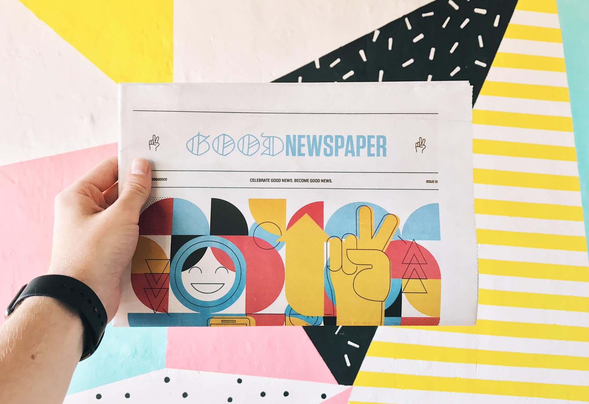
Having graphic designs in content like blogs helps readers break up all the text. It also helps encourage the reader to continue reading the blog. They can be used to illustrate a specific topic using an infographic. Infographics are easy to look at and can give a lot of information to the reader in just a glance.
They are the best of both worlds, being informative and visually appealing. Both are elements that will enhance the reader’s experience while reading a blog because people process information faster through visual content as compared to text. Photos and graphics help spark interest and gain the reader's engagement, which is what you want when writing a blog.
User Experience
People love information, but nowadays they want it instantaneously and don’t want to read through large blocks of text. Whether the text is on a website, a blog post, or a flyer, people do not have the patience for lots of text. This is where graphic design comes into play, it can help the user take in larger amounts of information without having to do all the reading.
Graphic design converts text into easily digestible information for the user which will enhance their experience. Time is money and when a viewer doesn’t need to take a lot of time to receive information it is always a good thing.

Making your graphic designs colorful to pull the readers eyes towards it but making it pleasing to the eyes is important. As mentioned above the colors you choose have a big impact on how your graphic design is viewed.
Typically you want to stick to a color scheme that matches with your brand or compliments your brand colors. This will keep the design consistent and enhance the user experience.
Different Visual Elements
There are many different visual elements that you can implement in your graphic designs that will help with user engagement and influence your prospect's decision-making process. Some of the major elements include:
Call to Action (CTA)
Call to Action is a basic element that belongs in every piece of content. CTA is “a short phrase that prompts a reader to take a particular action”. Whether the action is to subscribe to a newsletter, click a link to browse your website, or even leave a comment, it is important to have it on your graphic content.
CTAs help lead the reader along the customer journey and providing specific actions to follow will make the customer experience easier. When a customer has a good experience they are more likely to share it on social media or directly to their friends.
Infographics and Graphics in Blogs
Infographics are super important because of how much they stand out among other graphic content. Infographics use a collection of images and data visualizations along with text to create an easy-to-understand view of a topic. They present information much quicker than any other form of media due to the content-filled design.
They are great in blogs because they can help the reader understand a topic quicker which will improve the user experience.

Brand Logo and Color
Brand logos are a great element to put on every graphic design you create and use so that people know it is yours. When a random user finds your blog and it has your brand logo on the pictures and the page, they are more likely to remember it.
When you match the color scheme with the colors of your logo that also plays a huge part in customer retention because they will remember it better.
Conclusion
Good graphic design is a great tool that can be used to help your customers keep coming back. Graphic designs with lots of information that are easy to look at and align with your brands color will tie your content together and make the user experience better.
Websites should always focus on how the user will interact with it and when it comes to graphic design, the users are drawn to visual information quicker than text information. There are many different elements you can add to your graphic designs and we mentioned a few, including CTAs, and your brands logo.
All these things will help your customers along the buying journey and make their experience on your website more enjoyable, and who doesn’t want to have a good time?
To Learn more about WMA visit: www.wamplermacgregor.com


